Kyokan: Design Through Empathy
Shigeru Miyamoto approached character design not from a place of technical capability, but from emotional resonance. He called this philosophy "Kyokan" — shared feeling. When tasked with creating a protagonist for a new platforming adventure, Miyamoto rejected the trope of the square-jawed action hero. Instead, he drew inspiration from everyday people: a carpenter, a chef, a man on the street. The result was an Italian plumber whose relatability transcended cultural boundaries. This exhibit traces the creative decisions that transformed a simple sketch into a global icon whose silhouette is recognized by billions.
The Mustache Solution
Miyamoto gave Mario a cap and mustache not for style, but for technical necessity. The 16-pixel sprite limit made animating hair and facial expressions impossible. A cap eliminated hair animation, while a mustache clearly defined the face without requiring detailed mouth movements.
Character as Communication
Every visual element of Mario serves a communicative function. His red shirt and blue overalls create high contrast against the green pipes and brown bricks of the Mushroom Kingdom. The white gloves, inherited from animation traditions, make his hand movements readable during jumps and power-up grabs. Even his short stature was calculated: at 16 pixels, he occupies exactly the right amount of screen space to be immediately identifiable without obstructing the player's view of incoming threats. These were not aesthetic indulgences; they were ergonomic solutions to the problem of visual clarity on 1980s television screens.
From Sketch to Standard
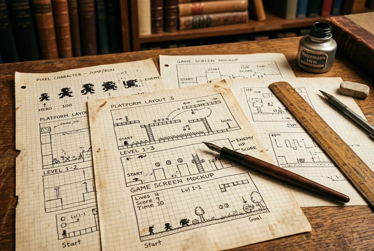
The original design documents reveal a character sheet that looks almost identical to the modern Mario. Unlike many contemporary mascots that evolved dramatically over decades, Mario arrived nearly fully formed. This consistency stems from the strength of the original concept: a character designed not to impress with detail, but to communicate with clarity. The blueprints show careful attention to proportion, color separation, and silhouette distinctiveness — principles that would later become foundational texts in game art education worldwide.
Miyamoto's blueprints demonstrate that character design is a form of user interface. Every choice must serve the player's understanding of the game world. The plumber from Brooklyn became the most recognizable face in entertainment not because he was the most detailed, but because he was the most clearly designed. In an industry often seduced by graphical fidelity, the original Mario sketches remain a humbling reminder that empathy and clarity trump complexity every time.
Beyond the Plumber
Miyamoto's design philosophy did not end with Mario. The principles established in those original blueprints — empathy, clarity, joy through discovery — became the governing ethos of Nintendo's entire software output. The Legend of Zelda, Metroid, Pikmin, and Splatoon all bear the fingerprints of the same design DNA. When Miyamoto sketched Mario's first jump arc, he was unknowingly establishing a corporate culture that would prioritize player experience above graphical fidelity for four decades. The blueprints are not merely historical documents; they are constitutional texts.
The influence extends beyond Nintendo. Designers at studios worldwide have studied Miyamoto's methods, reading interviews and watching GDC talks in search of the secret sauce. What they often miss is that the blueprint contains no secret. It contains only a commitment to the player: that every system will be comprehensible, every challenge will be fair, and every reward will feel earned. This ethical stance, encoded into a 16-pixel sprite, continues to shape the moral compass of the industry.
Curator Note
The Miyamoto blueprint is less about Mario and more about a way of thinking. It asks a simple question before every design decision: "Will this make the player smile?" Four decades later, few studios have found a better mission statement.

MUSEUM LOG
To leave a comment, please log in to your account.